Indonesia’s First Personalised Digital Health App
One of Indonesia’s largest healthcare providers set out to build a revolutionary digital health platform — one that bridges online care and in-clinic services, tailored to individual needs and lifestyles. I led the UX design across patient and clinician apps within a 40–50 person cross-functional team.
Indonesia’s first all-in-one digital health app went live, with a clinician companion app reaching 5,000+ installs — built with a 40–50 person cross-functional team across Singapore, Vietnam, and Hong Kong, and grounded in on-site immersion in Jakarta.
A single platform for an entire healthcare ecosystem
Indonesia is committed to improving general access to healthcare through digitalisation. In this context, one of Indonesia’s largest healthcare providers aimed to develop a revolutionary solution: Indonesia’s first digital health app perfectly tailored to individual needs and lifestyles.
The solution needed to go beyond booking medical appointments. It had to enable online consultations, deliver preventive care guidance, and provide personalised health information — all within a single, seamless digital workflow that connects patients, doctors, and back-office systems.
I led UX design across the patient and clinician apps, working within a large cross-functional team alongside BAs, engineers, and a consulting partner.
- Led requirements gathering and engineering — understood key user and business needs through stakeholder workshops and on-site immersion in Jakarta
- Mapped current workflows — documented end-to-end flows within both the patient and doctor apps, identifying friction, data gaps, and duplicated steps
- Proposed and implemented new workflows — designed the workflows to support the newly built connected ecosystem
- Designed and tested prototypes — created new screens from low-fidelity sketches through to high-fidelity Figma prototypes
- Established a design system — audited, consolidated, and rebuilt the component library for consistency and efficiency
Research
Stakeholder workshops, heuristic audit, requirements engineering, JTBD extraction
Synthesis
Workflow mapping, light personas, journey maps, current-state analysis
Design
Lo-fi → hi-fi prototyping, design system, localisation, developer handover
The through-line of this project: holding two roles at once — design and business analysis — so the requirements the engineers built from and the designs they built to came from the same head.
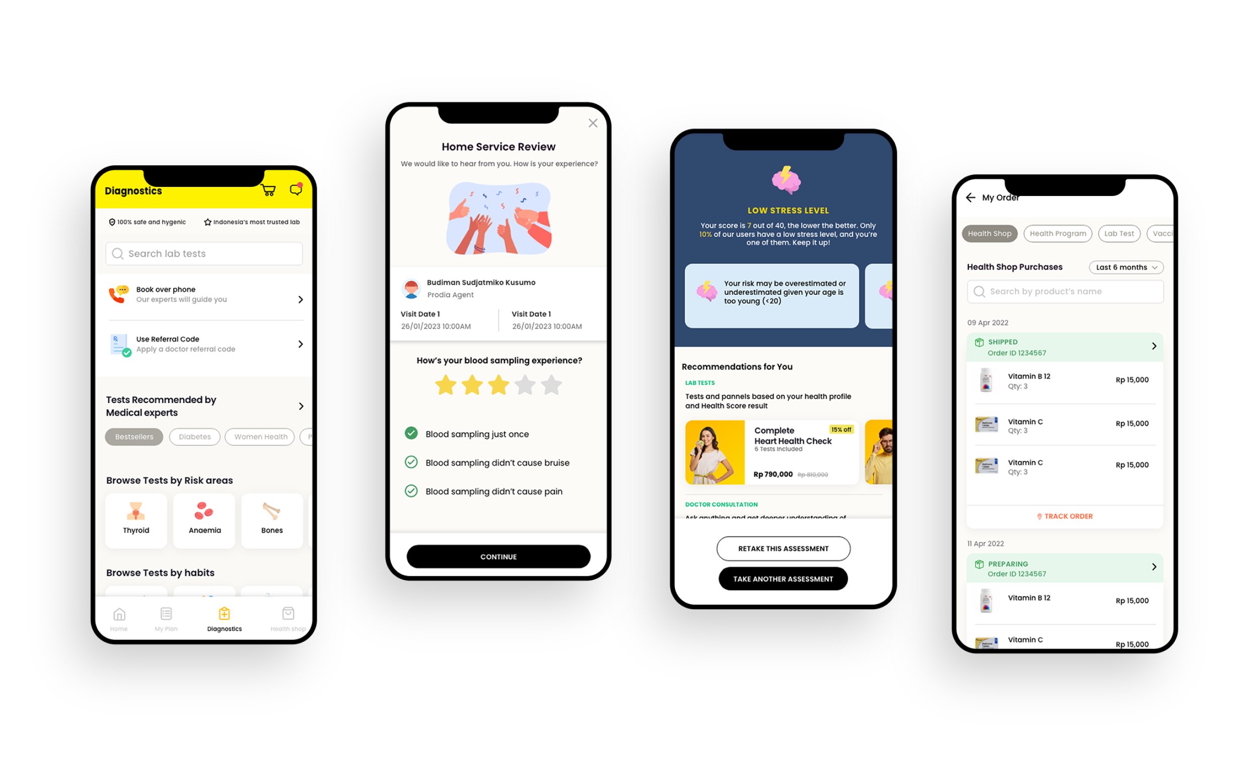
The patient app — diagnostics, home service review, personalised health scores, and an integrated health shop
Bridging online care and in-clinic services
The client needed a single platform that bridges online care and in-clinic services, giving patients seamless access to booking, consultation, and results in one digital workflow. The goal was to create a one-stop health app for bookings, consults, and preventive-care guidance that anchors their digital ecosystem.
But this wasn’t just a patient-facing problem. The ecosystem involved three interconnected apps — patient, clinician, and back-office — and the integration architecture had to link all of them into a single data flow. Designing in isolation wasn’t an option.
Formal user testing wasn’t permitted on this project. That meant every design decision had to be grounded in stakeholder walkthroughs, heuristic analysis, and internal validation rather than direct user feedback. It pushed us to be rigorous about the research we could do and transparent about the assumptions we were making.
Six phases from scoping to handover
We followed a structured but lean approach — from on-site immersion in Jakarta through to developer handover — compressing research, design, and validation into a focused engagement.
Scoping & Alignment
Drafted a lean research-and-design plan with objectives, timeline, and approvals for client sign-off. Spent two weeks on-site in Jakarta with the consulting and dev teams to absorb requirements and constraints.
Current-State Analysis
Ran a rapid heuristic audit of the live patient and doctor apps. Mapped “as-is” workflows end-to-end, highlighting friction, data gaps, and duplicated steps.
JTBD & Journey Mapping
Extracted implicit Jobs-to-Be-Done from earlier user interviews. Compiled light personas and journey maps for team alignment and prioritisation.
Ideation & Lo-fi Prototyping
Sketched low-fidelity flows in Figma and built clickable mid-fi prototypes for internal walkthroughs and early feedback loops.
High-Fidelity Design
Produced high-fidelity Figma prototypes with clearer onboarding, patient-doctor support, contextual search, and streamlined booking flows. Internal walkthrough with engineering for tech feasibility.
Validation & Handover
Walked through new flows with stakeholders and consulting leads to catch usability issues and workflow fit. Prepared the handover package with design specs for developers.
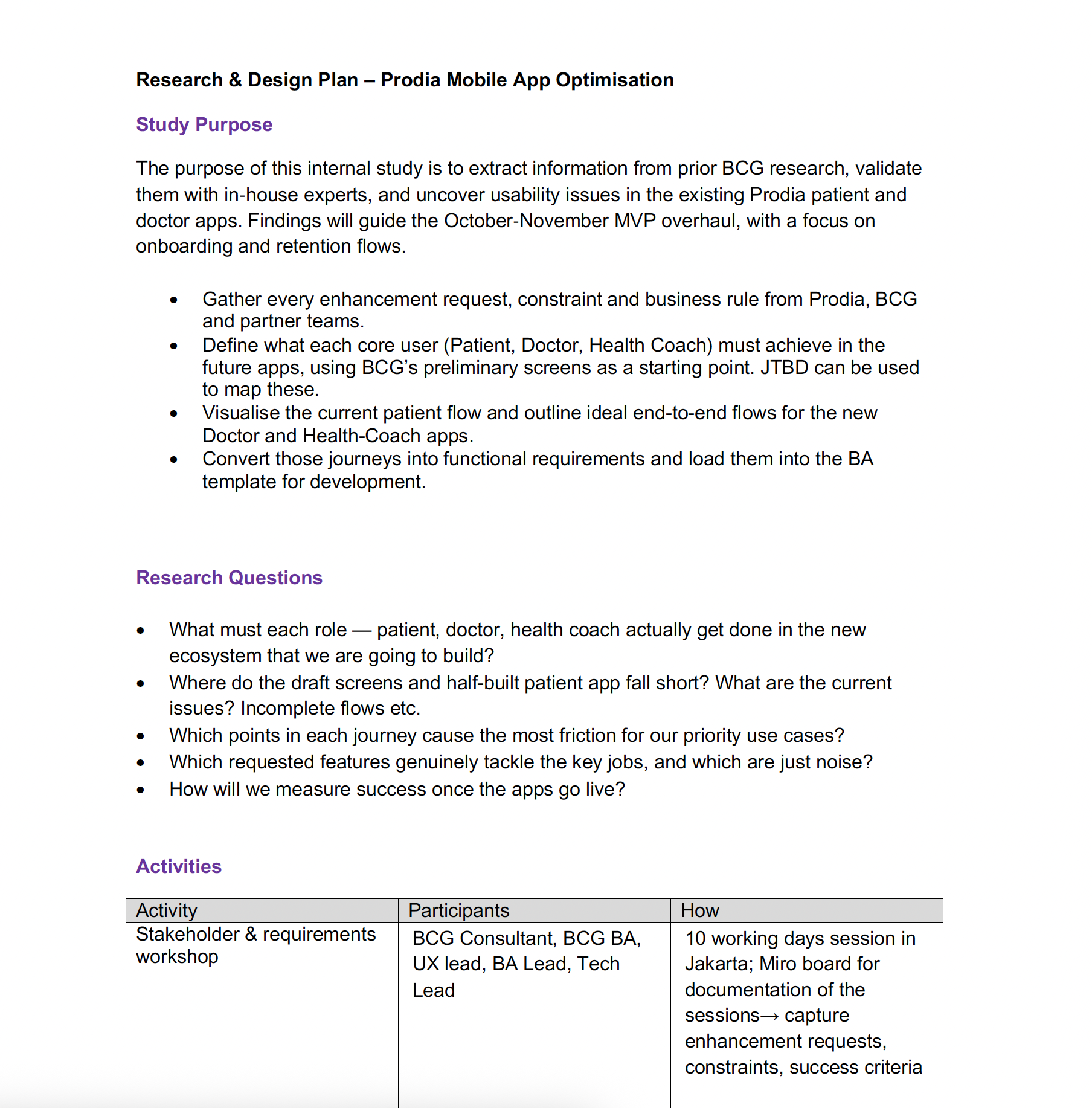
The research & design plan — scoping the study purpose, research questions, and activities before diving into design
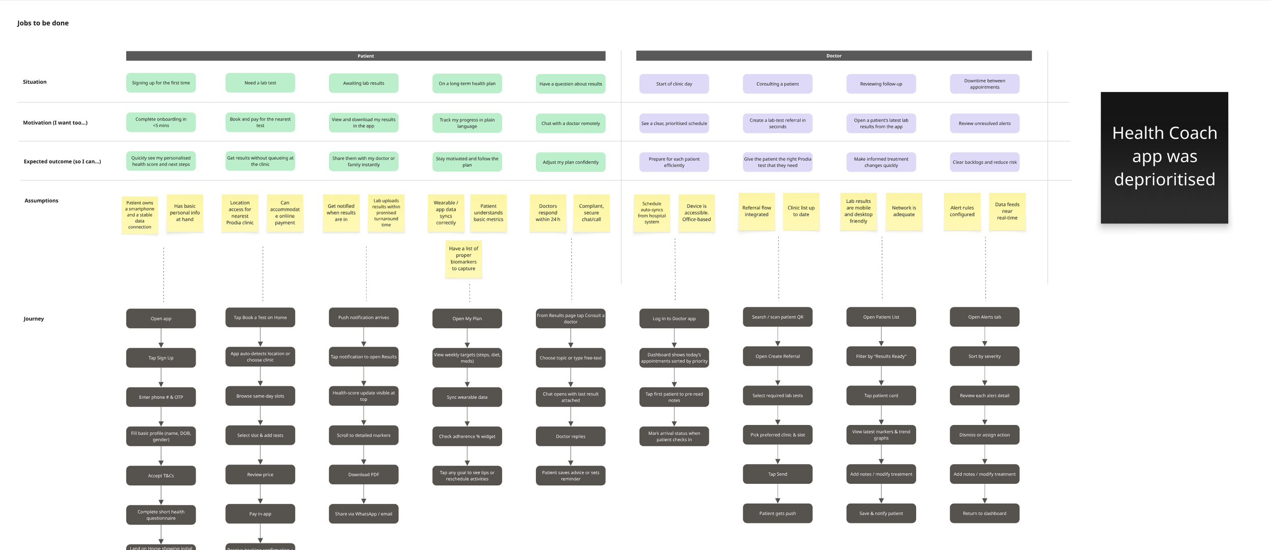
Jobs-to-Be-Done mapping — charting what each role (patient, doctor, health coach) needs to achieve across the ecosystem
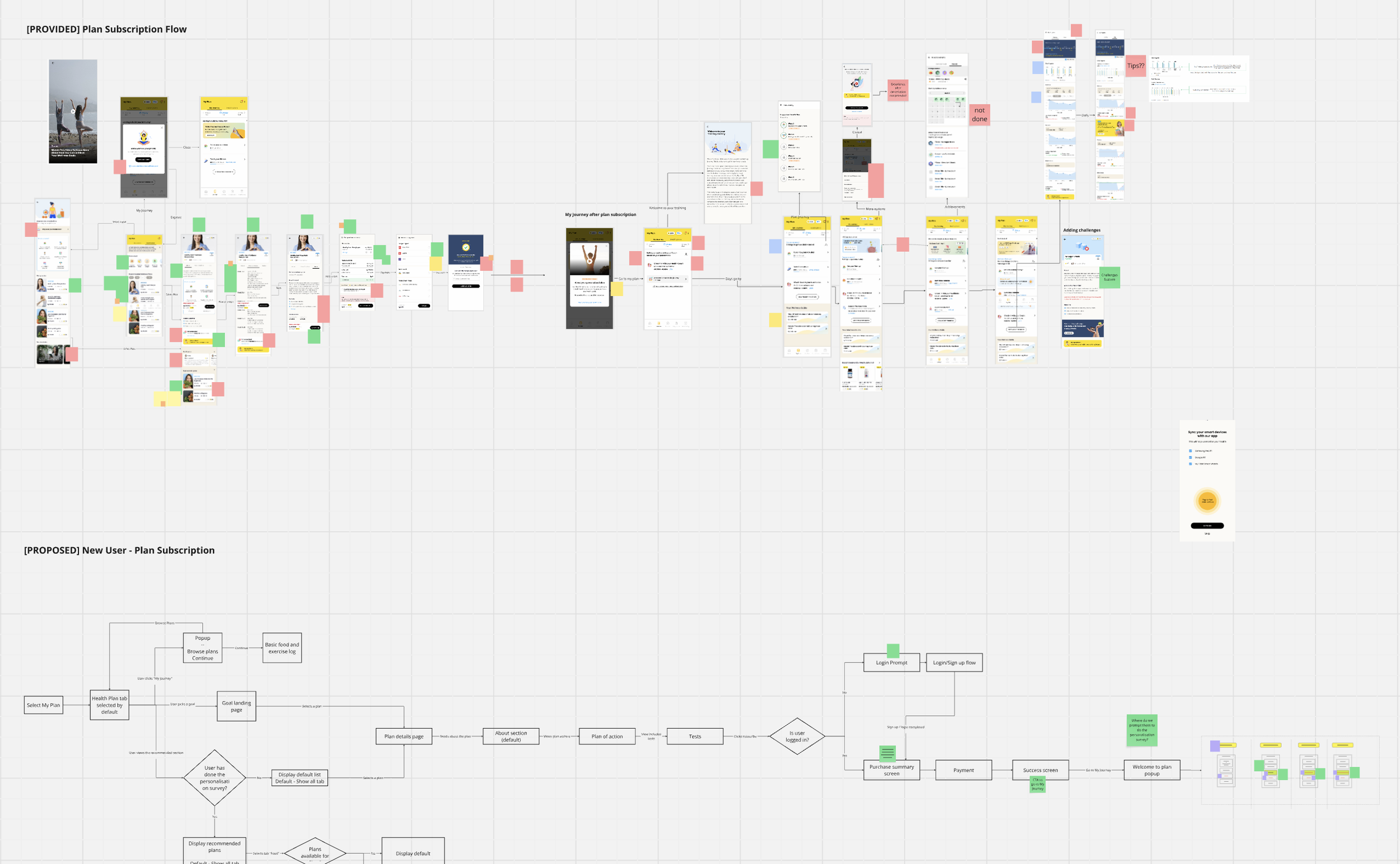
Workflow redesign — mapping the existing plan subscription flow (top) against the proposed new user journey (bottom)
Fixing the foundation before building on it
The existing design library was in rough shape. Multiple XD files with no single source of truth, duplicated styles, ad-hoc components, and inconsistent naming. Before we could design anything new, we had to fix the foundation.
- Many XD files, no single source of truth
- Repeated colours, text and spacing — “official” styles unclear
- Ad-hoc components without variants; updates didn’t cascade
- Inconsistent naming wrecked search
- Unused artboards bloated the file and slowed XD
- No proper hand-off specs
- Bahasa handled by full-screen duplicates, multiplying debt
- One Cloud XD master file as single source of truth
- Deduped colours, text, and spacing into a single asset library
- Rebuilt components with states so updates cascade
- Clear naming rules and bulk-renamed layers
- Published one-click Design Specs for dev hand-off
- Streamlined Bahasa localisation with tracked changes and an Excel glossary
A streamlined design system kept the UI consistent and sprint velocity high. When engineers can trust that the design file is the truth, handover stops being a negotiation and starts being a handshake.
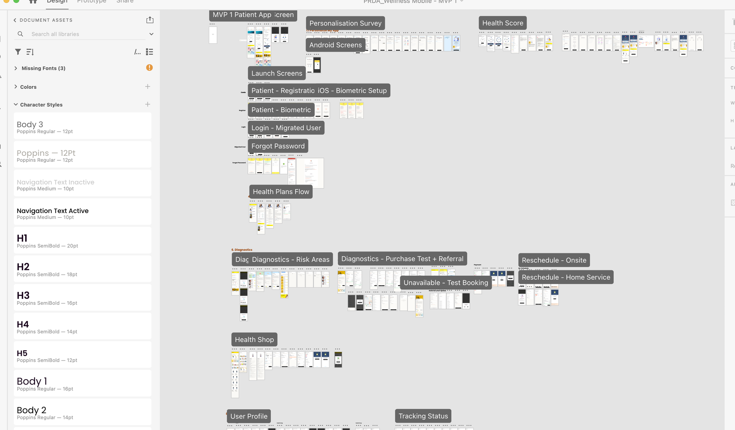
The consolidated design file — a single source of truth with organised assets, typography, and screen flows
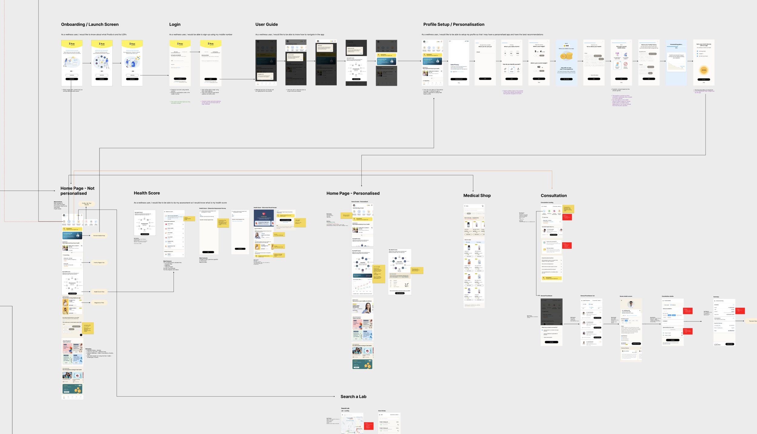
End-to-end patient app workflow — from onboarding and personalisation through to diagnostics, consultations, and health shop
From concept to live product
The project delivered tangible results — from a country-first digital health app going live to an integration architecture that proved the connected ecosystem concept.
Indonesia’s first all-in-one health app went live
The platform launched as a single point of access for bookings, consultations, and preventive care guidance — widening access to healthcare across the country.
Clinician companion app launched with 5,000+ installs
The doctor-facing app went live on Google Play, giving clinicians a connected tool within the same ecosystem as the patient experience.
Connected app ecosystem proved out
The integration architecture linked patient, doctor, and back-office tools into a single data flow — proving the viability of a connected healthcare app ecosystem.
Requirements cleared first review — development kicked off ahead of schedule
Thorough upfront requirements engineering meant no rework cycles. The clarity of the research and design artefacts gave the engineering team confidence to start building early.
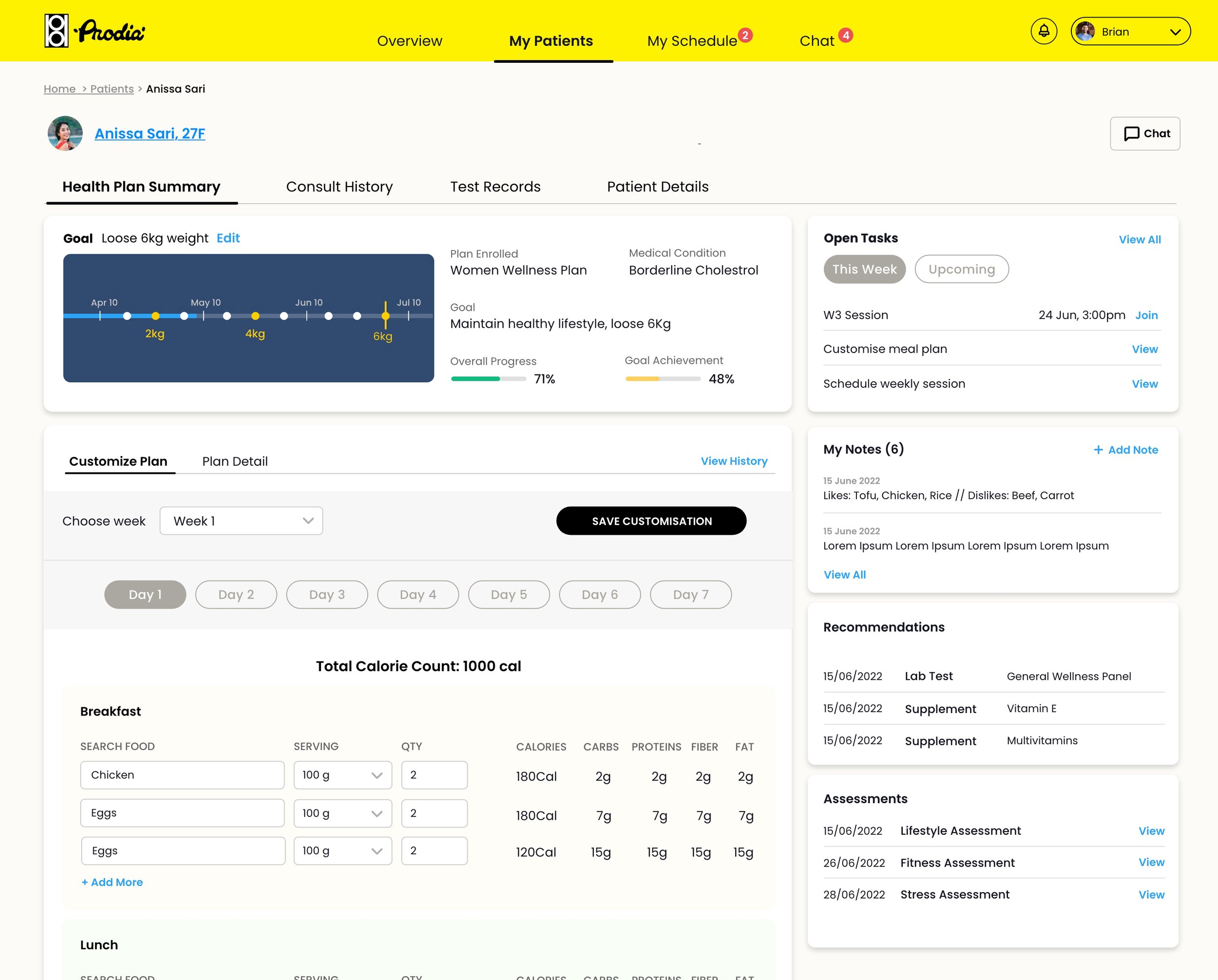
Clinician companion app — patient detail view with health plan summary, customisable meal plans, tasks, notes, and recommendations
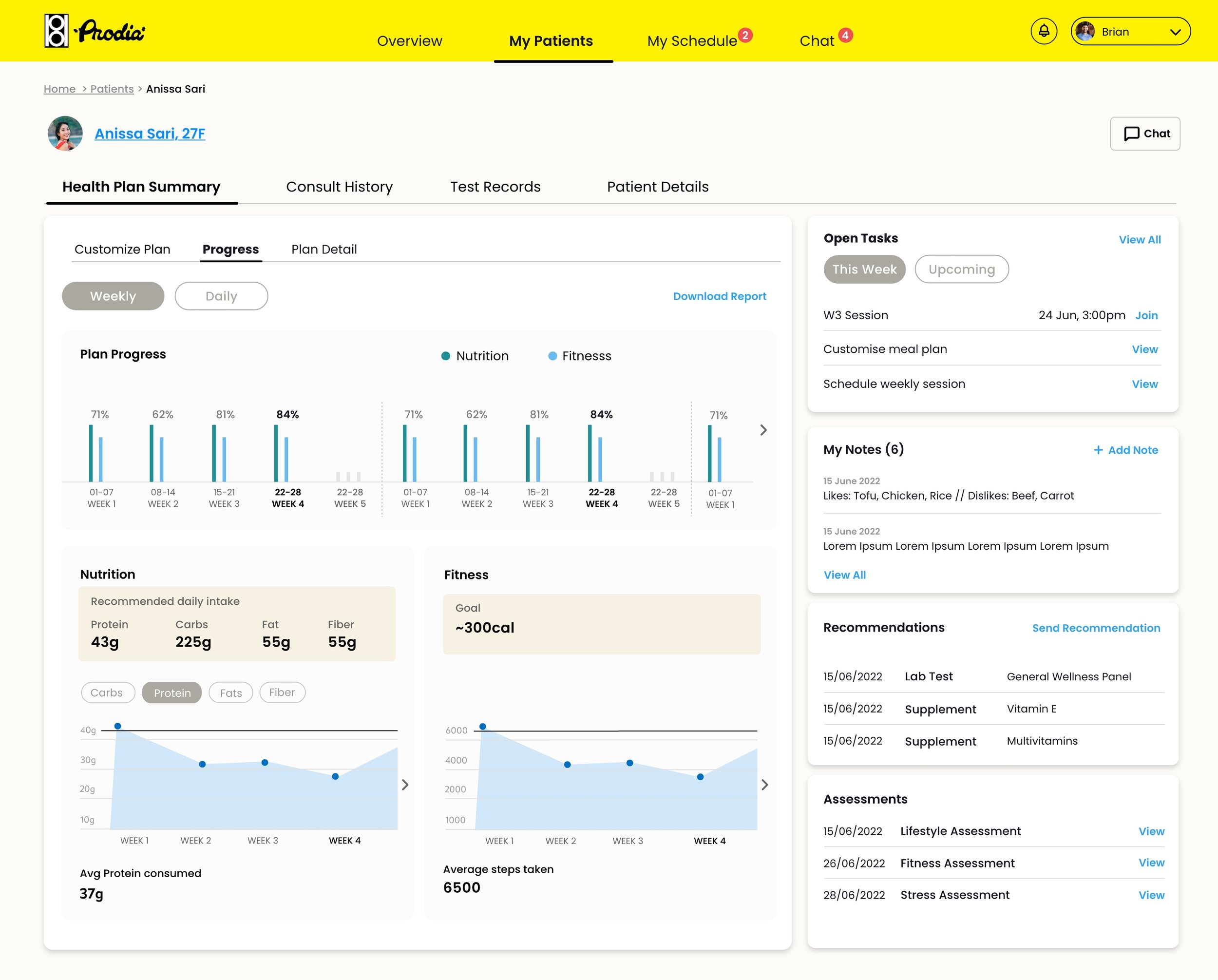
Patient progress tracking — weekly nutrition and fitness data giving clinicians a clear view of plan adherence
Collaboration and stakeholder engagement
On-site immersion over remote handoffs
Two weeks embedded in Jakarta with the consulting team, BAs, and developers gave me direct access to requirements, constraints, and the people behind them. Context that would have taken weeks of back-and-forth over email was absorbed in days.
Design handover as a conversation
I walked engineering teams through every new flow before handing off specs. Internal walkthroughs caught feasibility issues early and gave developers ownership of the design rationale — not just the pixels.
Cross-squad coordination
With 40–50 people spread across three squads and multiple countries, alignment didn’t happen by accident. I used the consolidated design file and shared workflow maps as coordination tools — everyone referencing the same source of truth.
Bridging design and business analysis
Requirements gathering wasn’t just the BA’s job. I sat in stakeholder workshops, translated business needs into workflow requirements, and fed design constraints back into the requirements process. This closed the gap between what was specified and what was actually buildable.
What I took forward
Fix the system before the screens
A broken design library creates friction on every sprint. Investing time upfront to consolidate, deduplicate, and document the system paid for itself many times over in velocity and consistency.
Design for the ecosystem, not just the app
Patient, clinician, and back-office apps aren’t separate products — they’re parts of one workflow. Designing them in isolation creates gaps. Designing them as a system creates coherence.
When you can’t test with users, be rigorous about everything else
Without direct user testing, every other research method matters more. Heuristic audits, stakeholder walkthroughs, and JTBD extraction became the foundation for every design decision.
On-site immersion changes the work
Two weeks in Jakarta gave me context that no brief or document could. Understanding the team dynamics, technical constraints, and cultural nuances firsthand shaped better design decisions.
Where this landed
We started with a brief to digitalise one healthcare provider’s services. We ended with Indonesia’s first all-in-one health app, a clinician companion with 5,000+ installs, and a connected ecosystem linking patient, doctor, and back-office tools into a single data flow. The most important shift wasn’t just the product — it was proving that user-centred design could meet both business targets and real-world patient needs, even within the constraints of a large, distributed team and no formal user testing.